Uniting Design and Art
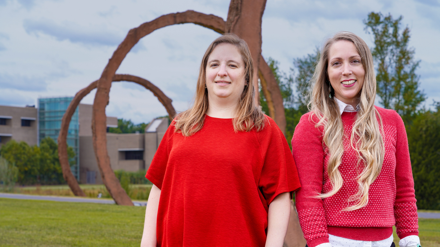
Christin Hardy always wanted to work in a museum. “I’ve always gravitated towards them – I interned at the Smithsonian Museum of Natural History as a specimen photographer,” she says. A friend from dance class sent her a job opening for a graphic design position at the North Carolina Museum of Art (NCMA) – and she’s been there for the past six years.
Senior Graphic Designer Christin Hardy and Director of Graphic Design Allison Maslow are both graduates of the graphic design program at NC State, and their education has been formative in the current rebranding efforts for the NCMA.
The current rebranding initiative was part of a larger reimagining of the permanent collections as “The People’s Collection.” Many visitors first encounter NCMA through off-site experiences, and it was important that the rebrand signal a sense of welcoming and belonging to all North Carolinians.
Allison Maslow, who earned her bachelor’s degree from the College of Design, was visiting campus a few years into her career when she ran into Michael Pause. He encouraged her to pursue a master’s degree in arts administration. After 20 years of full-time corporate experience and freelance positions in museums such as the Smithsonian and the Mint Museums, she is excited to use what she learned at both the College of Design and in Arts Administration in her role as director of graphic design at the NCMA.
Those major concepts that Maslow and Hardy learned in design school set them up for success to tackle such a large project. “It was important to me that I attend a university where I could learn graphic design and also writing, project management, and business skills,” says Maslow. “Having studios with real clients with concrete needs was helpful to form a solid foundation as a designer.”
Hardy agrees. “Everything we were taught gave me a leg up in my career. We were taught how to iterate our designs, and how to present your design to a client and ask for feedback to move the project forward.” Even her least favorite class while in school – typography – helped define her professional success.
“I hated that class,” she chuckles. “At the time, I did not have the maturity to appreciate it. But as I grew in my career, I realized that is the secret sauce to good design.”
Both alumnae have been working on the rebranding efforts for the NCMA for the past two years. As director of graphic design, Maslow has led those efforts since the former director stepped down in November 2021.
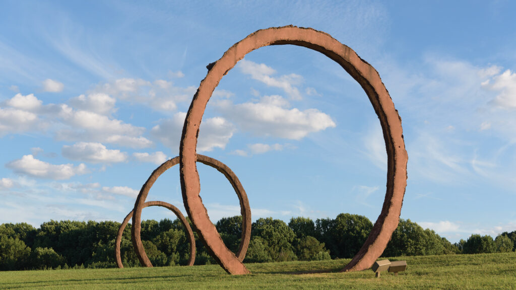
Dave Rainey, former director of graphic design at NCMA didn’t have to look too far for inspiration for the new visual identity. Drawing inspiration from Thomas Sayre’s looming sculpture on the museum’s extensive grounds, Gyre (1999) formed the inspiration for a swooping, iconic design.
The logo was born from one of Sayre’s sketches that was in the office of former museum director and passed on to current director Valerie Hillings. Rainey translated the sketches into an illustration that evokes volume, forward motion, and a distinct sense of place.
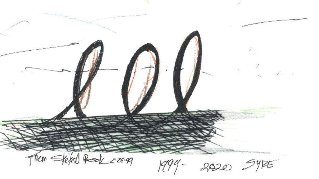
“It feels like a brushstroke, with a lot of texture,” says Maslow. The sketches of Gyre were a great way to unite and visually represent both the sculpture park and the galleries. Complementing the logo in its signature orange are color pairs in analogous colors as well as neutrals.
But the iconic image was only one part of the new visual identity of the museum. Maslow and Hardy carefully considered the typefaces to complement the design. Case, designed by Erik Spiekermann, Anja Meiners and Ralph du Carrois, was chosen as a 21st-century typeface with maximum readability and language support.
Accessibility in the design was an important factor, as it signals the museum’s commitment to serving all the people of North Carolina. The hyperlegible font with high contrast will be utilized across museum communications. Efforts also include Spanish translations of campus signage, maps, and gallery text; captioned video and audio content; and accessibility icons to alert visitors to accessible areas and resources on campus.
The design has come full circle for Hardy in particular. She remembers being in design school when the NCMA’s previous rebrand came out, with the font based on the skylight design of the West Gallery. “Meredith Davis brought the design into class and asked ‘What do you think of this?’” she recalls.
“We’re prepared for that classroom discussion to go either way,” Allison laughs. “Change can be intimidating for some people, but I’m hopeful when visitors come to the museum campus and see the rebranded system as a whole, they will appreciate the work we’ve put in to design a cohesive, accessible, and welcoming brand.”
This post was originally published in College of Design Blog.
