Students Earn Scholarships, Design Inclusive Textile Products Through Cotton Incorporated Competition
By Sarah Stone
Six Wilson College of Textiles students are wrapping up the semester with scholarships after winning the “Cotton for Universal Design” competition, sponsored by Cotton Incorporated as part of the Cotton in the Curriculum grant program.
The competition, which was open to fashion and textile design (FTD) students enrolled in select courses, challenged entrants to determine ways that cotton products could be used to improve quality of life for children, young adults and older adults using Universal Design principles. Universal Design, which many scholars argue began at NC State, aims to create products that are accessible to people with a wide range of abilities but also appealing to any consumer.
Winners were chosen by a panel of judges, including Professor Lu Liu, who specializes in Universal Design.
“The students all came up with beautiful work,” Professor Liu, who also heads the graphic and industrial design departments at the College of Design, says. “The beauty of Universal Design is that it is not designed only for people with disabilities. It is something that everybody will enjoy.”
Each entry had to include product mockups, photos of cotton fabric samples, and market research indicating how the product would both appeal to consumers and support their chosen customer demographic.
“I often just have that energy to create something but it seems kind of random. So it was really exciting to think about creating something for a specific group and for a specific need,” second place winner Anna Stuffelbeam says. “And that helped me think outside of my normal design process.”
Student awards and cotton yarns and fabrics were supported by the Cotton in the Curriculum grant, along with a speaker series and a design workshop held earlier in the year.
“Through these grants and competitions, the Wilson College forges a close relationship with industry,” Cotton Incorporated Senior Vice President of Global Supply Chain Marketing Mark Messura says. “And as a prospective student, or as a parent of a prospective student, that’s a huge advantage. You have a program that is technically sound but it’s also connected to the industry. So that’s ensuring that graduates are market-ready.”
Below, read more about the first, second and third place winner’s creations in their own words.
[callout bodyfontface=”universlight” heading=”Chloe Belton” headingtype=”p” headingfontface=”universroman” headingicon=”noicon” textalign=”textleft” type=”img” bgcolor=”innovationblue” img=”18135″ mediaposition=”left” margin=”normal”]First Place
Mature Years
“Seeking Peace”[/callout]

My inspiration was based on depression and anxiety among widowers. So the feelings they go through, the transitions through their home and how they are dealing with that, and how to make them feel more welcomed and comfortable in their situation.
A lot of my research was on a personal basis because it’s something my family’s going through right now.I also did some research on certain colors that can help with stimulating relaxation, or any way to soothe widowers. Colors like white, blue, pink, I found to be really soothing for them.

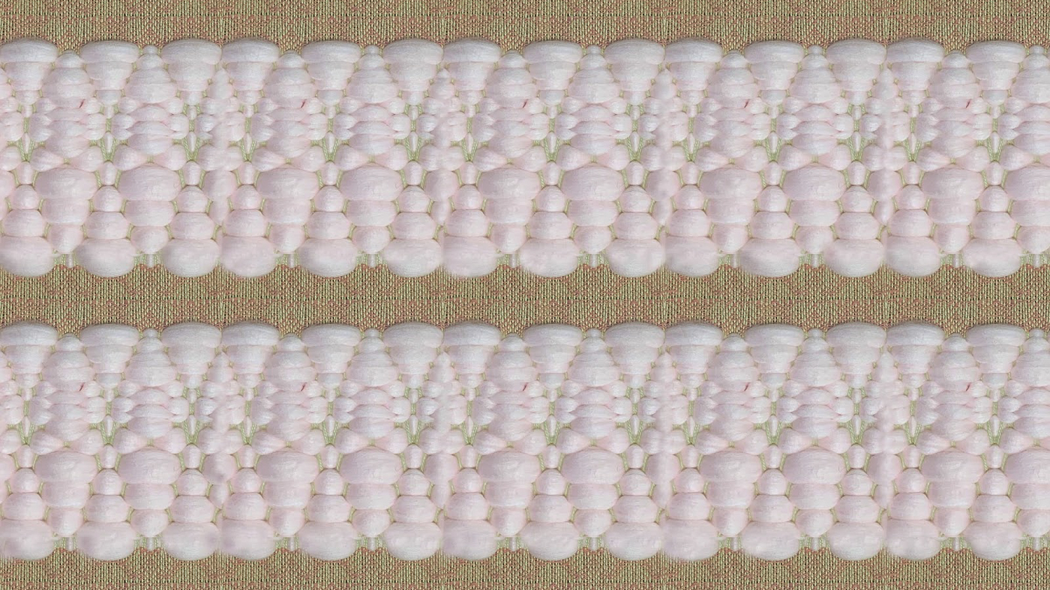
[callout bodyfontface=”universlight” heading=”Anna Stuffelbeam” headingtype=”p” headingfontface=”universroman” headingicon=”noicon” textalign=”textleft” type=”img” bgcolor=”carmichaelaqua” img=”18119″ mediaposition=”left” margin=”normal”]Second Place
Younger Years
“Gooseberry”[/callout]

I was inspired by looking into different needs for children with autism, attention deficit disorder (ADD) and attention-deficit/hyperactivity disorder (ADHD). I was kind of looking at the tactile interest, so adding some dimension to the wovens. I also found some research on different products that were specifically made for this group already and looked at what was missing there. I found that the group really preferred cotton as a fiber.
When I look at colors and patterns, I’m often looking at nature and pictures that I took myself in nature. There’s one specifically of Cape gooseberry that has some different variations and that inspired me for color and texture.

[callout bodyfontface=”universlight” heading=”Milo McKnight” headingtype=”p” headingfontface=”universroman” headingicon=”noicon” textalign=”textleft” type=”img” bgcolor=”genomicgreen” img=”18099″ mediaposition=”left” margin=”normal”]Third Place
Younger Years
“Deaf That”[/callout]
My focus was on deaf and hard of hearing people, our culture and community, and my experience with eye fatigue.
I depend a lot on lip reading. So I have to really focus in on that tiny little area on somebody’s face, and it makes me really tired. Also, a lot of times deaf and hard of hearing people have hearing aids or cochlear implants. That can cause a lot of headaches and fatigue too. So it makes your entire system kind of exhausted just trying to communicate.

I decided my colors, I wanted them to have a lot of meaning. When I experience eye fatigue, sometimes colors can be really bright and overwhelming, and it can really impact being exhausted. So I wanted different options of colors. I wanted them to be more muted tones.
At the same time, I don’t want it to be too dark because that’s kind of depressing. I wanted it to match the community and this spirited happiness and the positivity of it. Everybody’s really proud to be deaf. It’s deaf identity.

This post was originally published in Wilson College of Textiles News.