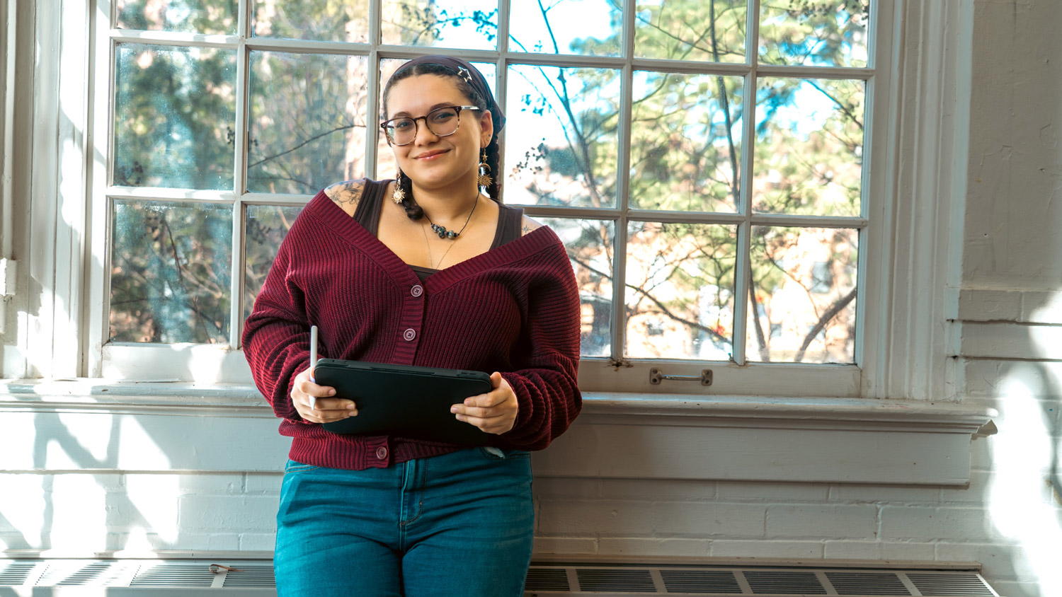
The Process to Design Elbow
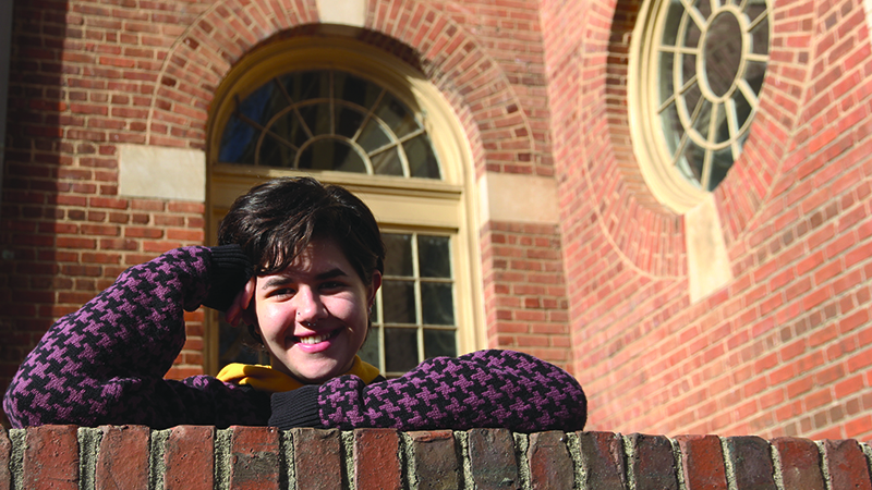
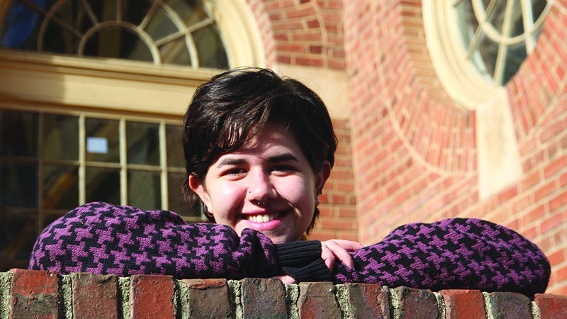
This past semester, Clara May, a junior graphic design major, had the opportunity to combine her interests in graphic design, music, photography, publication, and urban typography by taking GD 417 Information and Publishing Design Systems. In the studio, students learned about publication systems by studying typographic language, writing, and reading. They specifically focused on grid, form, and font systems while designing their own multi-page document as a final project. May created a handmade publication she calls Elbow, and she recently gave us a behind-the-scenes look into her design process.
ELBOW. Publication designed and developed by Clara May, NC State Design student from NC State – College of Design on Vimeo.
Q: How did you come up with the name Elbow?
Clara: I knew I wanted [my publication] to be about music and design—the intersection of music and design. So, I went on a random word generator because I knew that the name was subjective to the whole thing. Nothing really caught my eye, and I just was sitting there, and I was like, “Elbow,” and that’s how it came to me. I just stuck with it because I think it’s a funky name that’s going to draw people in and there’s kind of a mysterious allure to it. It’s funky.
Q: Why did you choose the topic of music and design?
Clara: My dad’s a musician, and my brother plays music. There’s always music around me, and everyone’s talking music. I was always the visual kid of the family. So, it was a personal project to show how music and design shape each other so much. I found a bunch of articles that look at different genres of music and how typography has shaped the way consumers interact with music and how music has shaped how typography works. The two give and pull with each other.
Q: How did you make the final project?
Clara: I printed all the pages—all of the title pages are printed on vellum and then inserted. Then, I did a Japanese stab binding. It’s four holes, then you get the awl and stab through the paper, [binding it with] a waxed linen thread. I learned about [stab binding] my freshman year. There was a workshop for it, and then I started binding my own sketchbooks and journals. I was selling those for a little bit to friends and family. I just love book binding. Any sort of original form of book publication, I’m very into, like the old school styles.
I decided to do the stab binding over the normal staple bind that can be done in seconds downstairs in the letterpress room because, like music and like design, there’s more of this authentic hand-done feeling. So, I wanted to have that carried through. Even though it’s talking about music that’s not on paper and the design is all done digitally now, I wanted it to feel hand done—like the passion of someone that’s making music carrying through my passion for making publications. It’s more like a craft thing.
One thing that was cool about this project is in the prompt it said that we had to take all the photography ourselves. So, if we wanted to include imagery, we had to go out and take all the photos for it. You know the light polls where they staple music posters? I went out and found a bunch of those that had a ton of staples and wet deteriorated band posters—like a symbol of this sort of dying form of communication design in relation to music. It is sort of like ghost letters from the back of buildings. It’s a remnant of how we used to consume music. So that’s something I included on every page—all the papers became a motif throughout the whole thing… sort of a texture.
Also, I painted my own typefaces for this project. At first, I wanted everything to be handwritten and hand produced. But I realized that it was not feasible. So, I painted my own typefaces and included them on the section breaks. So, it’s an overlay of my hand-painted text on the band posters, almost like a texture again. It’s sort of like tagging. I’m very into urban typography. I have a whole Instagram account dedicated to urban type found in Raleigh. I’m very passionate about that kind of stuff. I brought everything I loved into [this project].
Q: What did you learn from creating this publication?
Clara: I kind of struggled. Relying on text to convey a message and not a visual drawing or symbol to convey that message was really difficult for me. I learned that I needed to make rules for myself to be able to make things work within a publication. So, I had to iterate and iterate and define different rule sets for how elements will be placed around the page. I like to put things sporadically and [make] everything kind of crazy, but in this project, I couldn’t really do that because it had to be a pristine publication.
I learned a lot about grid systems. I use grids in almost every project that I do, but they’re always pretty flat and static—like 6 by 8. I decided to make [this project] really funky by having a really skinny column, a medium column, and a really big column. I played with width of the columns in grids, and that’s something I never thought of doing. I got a bunch of Post-it notes, and they all happened to be three different sizes. I started playing with the big medium and small, and that totally dictated the way that everything was set up.
I put myself in the shoes of the reader to think about how they would navigate through a text, what information they would pick out of each page first, and how that would shape their understanding of everything. Picking and choosing pull quotes to highlight is very meaningful and can totally dictate the way that someone reads a piece.
Then second semester freshman year, when we started doing graphic design stuff, I was like, “Yeah, I’m where I need to be. This is absolutely perfect.”—Clara May
Q: How would you grade yourself?
Clara: I’d give myself probably an A-minus. I didn’t have a lot of process. I just kept iterating on the same document and printing [it] out. I’m normally very good at having a lot of process and documenting every step of the way. This project was a lot of brain dumping constantly on the same document. And then I made the final document.
I would probably have people read it that aren’t designers and that aren’t musicians and see if they understood the message I was trying to get across about these two things being harmonious—like user feedback. My only metric of knowing if something’s successful is having people read it.
Q: Did this studio inspire you to change your potential career direction?
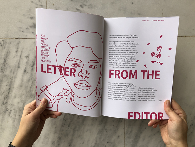
Clara: I’ve kind of known that I wanted to do publication [as a career], so I worked on The Windhover as the design editor last year. That was my first big publication that was printed and mass produced. So, I’ve known that I love print. I love paper and all things about it. Now applying to jobs, I’m trying to look for print media and publications. This was the culmination of all my interests in one because it has some illustrations, it has my own photography as well as publication, music, and design—all of it.
Q: Did You Always Want to Be a Designer?
Clara: I didn’t realize I wanted to be a designer until freshman year of college. I’ve always done fine arts and thought I was going to go to art school. But, my art teacher in high school always said, “Clara, you need to try graphic design. I could see you doing this because all the stuff you do is pretty graphic.” And so, I was like, “Okay, I’ll give it a shot.” Then second semester freshman year, when we started doing graphic design stuff, I was like, “Yeah, I’m where I need to be. This is absolutely perfect.” I don’t think I’ve doubted it since. It’s been more like learning along the way, not a lifelong dream.
- Categories: