Justin LaRosa Designs for a Competitive Edge

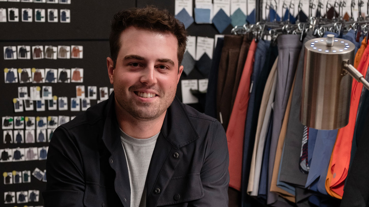
Design innovation for a mobile phone or laptop isn’t hard to spot. But what about for an athlete’s jersey? Can the graphics on players’ uniforms make them feel stronger? Can the font selection for a uniform number on a football player’s jersey create a “warrior effect?” Justin LaRosa [10′ GD], apparel designer for sportswear giant, Nike, thinks so.
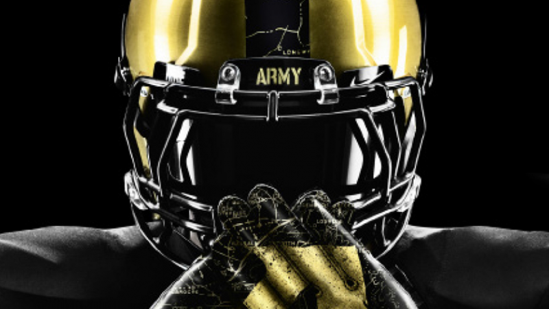
Justin LaRosa [‘10 GD] joined Nike in 2011, where he designs on-field apparel – from helmets to shoes – as well as in-store, retail clothing. He consults closely with Nike’s technicians who design the cut-and-sew lines of the garment before beginning the conceptual process of designing the graphics. Each piece is a story. Whether the public really sees everything that goes into a uniform is secondary to how the players view it. For example, LaRosa recently designed uniforms for the 2012 Army / Navy football game – an annual event he grew up attending as a child.
“People might be surprised at the amount of research that goes into sportswear design – especially athletes’ uniforms. We interview players, coaches and athletic directors to get into the mind of an athlete. Our goal is to mitigate any distractions from their clothing and gear so they can perform to the best of their ability,” LaRosa says.“It’s a huge game for both teams. The cadets for both schools are essentially on lock-down from the beginning of the semester until Christmas break, then they are all let out to go to this football game. You can’t begin to imagine the energy in the stadium,” explains LaRosa. Nike outfits both teams and LaRosa was the lead graphic designer for the Army – also known as the United States Military Academy at West Point. The game is held in Philadelphia every year in late-fall or early-winter, and athletes can expect cold weather, even heavy snow. For inspiration, LaRosa decided to dig through the archives at West Point to find the coldest land battle in Army’s history.
“It was the Battle of the Bulge – a well known World War II battle in northern Luxembourg. The army had a bunch of young guys under General George Patton’s command taking on Adolf Hitler’s German troops. At the same time stateside, the Army’s football team was in the process of winning three back-to-back national championships. It was a great time in the history of West Point,” LaRosa says.
To capture this important time in Army history, LaRosa found old battle maps drawn in 1941 and received military permission to use the maps as a camouflage-like graphic throughout the uniform – the under-compression top, jersey numbers, helmets and footwear. Additionally, there was the opportunity to create an “intimidation effect.”
“The players saw the design as a cool new take on camo. What was so unexpected was that there ended up being some WWII vets at the game who looked closely at the design and recognized the maps,” says LaRosa. “It had real meaning to them.”
Despite losing the game 17-13, the players had a real fire to fight because of the design of the uniform. Army coach Rich Ellerson, a historic military buff, loved the design and was able to use the story behind the uniforms to motivate players by sharing an important time in the school’s history.
Trips like the one LaRosa took to West Point are part of his design process for Nike. “We visit the schools to build a relationship with the coaches and athletic directors and then get our inspiration by researching the school’s history. At Nike, we want our designs to be authentic and meaningful. Using a school or team’s history is often the best way to do that,” explains LaRosa.
Design innovation for Nike, and LaRosa, is about creating peak performance – making materials lighter and the fit tighter so the uniform feels like another layer of their skin. As a graphic designer, LaRosa takes the creative process a step further by turning their clothing into something that inspires them to unleash the warrior within. While he likes helping boost Nike’s retail wear, his heart lies in creating team uniforms. LaRosa’s design of Ohio State’s uniforms uses a special material that reacts and lights up when photographed. The design of these pieces requires thinking about all kinds of scenarios for use — how they appear on television, how they react to stadium lighting, and how reflective they might be.
How does this affect the competition? Perhaps it is an example of “brand psychology.” “Put a tri-athlete in a suit designed to mimic the texture and speed of golf balls [because they can fly so far] and they will respond psychologically. They will immediately feel that they can perform better,” LaRosa explains. “It’s neat to be at a Boston Red Sox game and see fans wearing a T-shirt I designed; but there is nothing better than watching 100 football players running onto the field in one of my uniforms and having them win the game,” LaRosa says. “That’s what makes me love this job.”
Eyeing the Numbers
Not long after starting at Nike, LaRosa felt like he was back in the College of Design in an introductory level typography class thinking about legibility versus readability and other fundamentals of type design. “When I started at Nike, I noticed many college uniforms used really old [and honestly ugly] number stats for their jerseys. It was obvious that no ‘design-eye’ had been on them,” LaRosa says. “Sitting in a Type 1 class, I wouldn’t have necessarily thought I would use that knowledge so quickly in my career – but it was a really practical skill that I needed to know. I loved that the College of Design trains us to be ‘design thinkers’ – not just people who design for other designers,” LaRosa explains. “We are taught to go into any type of industry and use good, practical design fundamentals as a solid business strategy. I feel that is what really sets the College apart from other design school programs.”
- Categories:


