McCain’s Optimum Look is an interesting read especially in terms of our studio discussions on typeface and personality.
Amongst the critiques of other well know designers, Debbie Millman, host of the podcast Design Matters shares her own thoughts: “…it is still a rather bland face being used in a rather bland way. Like a good pair of shoes and a well-cut suit, type makes the man (or woman). Consider typography to be the window into the soul of the candidate’s campaign… And in this campaign, what you see is definitely what you will get.”
Ouch… haha. I’m not ashamed to admit that I’ve used Optima, and it was Denise who asked me to look into the historical usage of the font last year. I was drawn to the way in which it was used in the Vietnam Memorial. It doesn’t work for me in how it’s used for McCain’s campaign — I almost didn’t recognize it as Optima because I think it’s in an extra black font-weight.
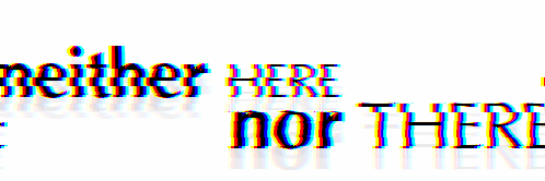
After reading all these opinions on Optima, I don’t know how I will be moving forward. I honestly didn’t know people felt so strongly about this typeface being neither here nor there. I wonder if this is how designers feel about other humanist typefaces because they’re noncommittal and in this in-between state of serif and sans serif. Do contemporary designers avoid humanist typefaces because they’re based on handwriting (more specifically calligraphy)?
A few readings I came across mention that some designers were forced to use Optima too often over the years — when did this happen?? — again, I had no idea. Anyways just thoughts and ramblings. I would love to have more insight on how different typeface styles have been used over time. This way I could potentially avoid puzzled or even appalled expressions from far more experienced designers when I use a typeface that has all this excess baggage.