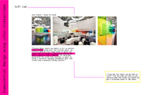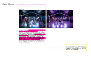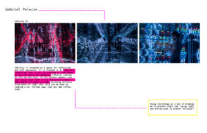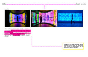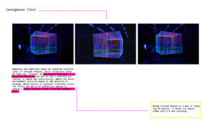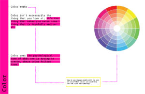
I’m currently working on a studio project where I analyzed two spaces and tried to understand the different information that is available in both those spaces. How can the information be presented in a more efficient way, where the interactors are experiencing this information? I went through a process of iterating different ideas where scale and placement affected what type of information this was: public, semi public/private and private. In most of my iterations I used a lot of color as a way of attracting people. But the other day Rachel asked me a question “How can the color have meaning? How is the color related to the information?”. So I’ve been trying to tackle this question. Where do I even start? It seems to be such a big and daunting question. I started by looking at examples of interactive and experiential information like projects by Soft Lab, SITU, Jeongmoon Choi and of course diving deep into books to try to get as much as I could. As a way of understanding all the different ways in which these designers have used color I created these images to help me out.
I don’t think I have an answer to this question yet, but I feel like I’m headed somewhere.