Our (downstairs) studio “challenge” is:
Collect as many uses of papyrus real life as you can. Document your findings. *
*I’m paraphrasing
Well, since that SNL sketch, I’ve had papyrus on my mind. And I’ve been taking pictures.

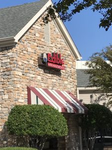
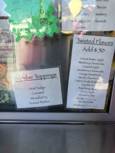
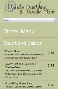
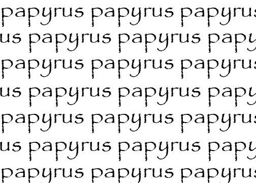
It’s everywhere. On vans, on store fronts, on fliers for exotic teas. It’s even on menu for David’s Dumplings. And papyrus isn’t exactly a subtle typeface. It’s easily recognizable. Chris Costello designed it to represent what he thought vernacular writing would look like if the English language existed two-thousand years ago (http://www.costelloart.com/interview.html). He spent six months hand-drawing the letters with a calligraphy pen on textured paper (i.e. actual papyrus) to create the effect.
So, what draws so many companies to papyrus? What makes a brand think, “Yeah, this looks good and really represents our product”? How much does a typeface’s designer’s original concept and intentions influence how that typeface is later used? Do they matter? Should they matter?